
May Gardening Tips
Elements of Garden Design - Working with Color
From Marie Iannotti, Your Guide to Gardening.
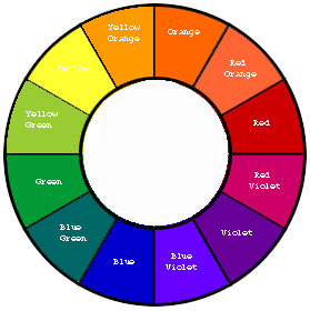
Most garden design advice begins with a discussion of color, texture, and form. Color is arguably the most prominent factor in garden design and often the first one considered it is what most gardeners are drawn to. We know what we like when we see it. Good garden design involves knowing how to combine colors so that the final product will be one we like. Only practice and experimentation will develop your eye for color and allow you to see the differences between colors, but a good way to start is by studying the color wheel used in art.
On the wheel, colors are arranged by their relationships to each other, in a progression. Violet-red to Red to Orange-Red to Orange to Yellow-Orange to Yellow and so on, in the same order as they appear in the spectrum. Most modern color wheels only contain 12 colors, while there are many more subtleties in nature. However, it is a good tool to begin to train your eye to see the relationships between colors and how they transform and play off of one another.
While knowing color vocabulary isn’t necessary to successfully working with color, learning some key terms can help you make sense of color combining.
BASIC COLOR PALETTE
Primary Colors on the wheel are: Red, Yellow & Blue
Blending these 3 colors gives us the rest of the rainbow.
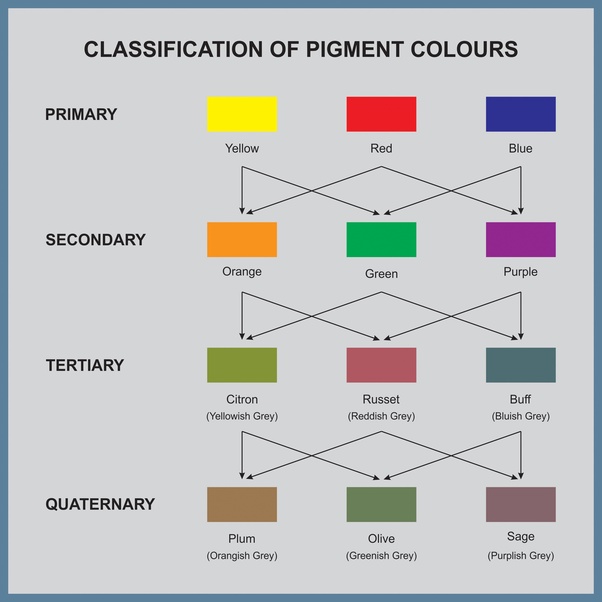
Secondaries and Tertiaries round out the 12 colors shown on the wheel.
Secondary: Orange, Green & Violet
Tertiaries: Yellow-Orange, Yellow-Green & Blue-Violet
COMBINING AND PLAYING WITH COLORS IN THE GARDEN
Basically, it breaks down to 2 choices:
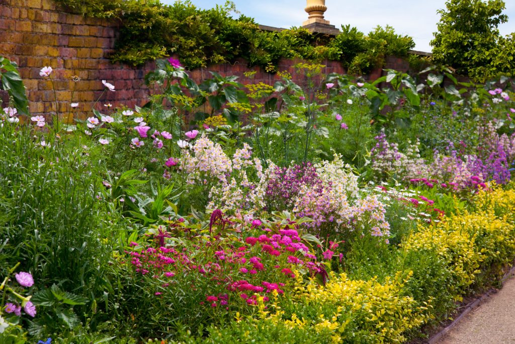
- Harmonious (colors that are next to one another and share some value) or
- Contrasting (colors that don’t)
Harmonious Combinations
Monochromatic
* Choosing one hue and using it in its various shades, tints, and tones.
* Less is More
* A good beginners approach, as it avoids the chaos of too many colors
* Requires an eye that can see the differences within a color
* Also a very sophisticated approach in its subtlety
* Texture and repetition become more noticeable and important
* Green makes a good transition from one shade to the next
* Can also be employed as a progression, moving from one hue to the next on the wheel, the next...
Analogous
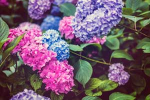
* Working with 2-3 colors that are adjacent to one another on the wheel (red, orange, yellow)
* Makes for an easier, less jarring transition for the eye
Contrasting Combinations
Complementary
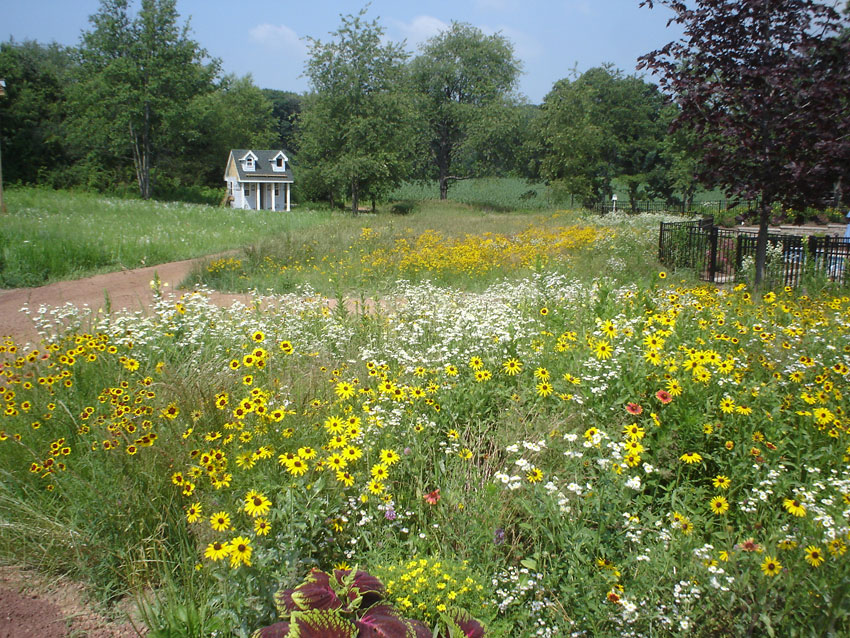
* Uses two colors opposite each other on the color wheel (red/green, orange/blue, yellow/purple.)
* No common pigment means maximum contrast.
* Might be a bit jarring if there is too much contract used
* Try to favor one color and use the other as an accent or focal point
* Again, use texture and form for variety, rather than too much color
* You could also work with 3 equidistant colors (Triads) or
* One color and the 2 colors on either side of its complement (Violet with Yellow-Orange and Yellow-Green) (Split Complements)
Polychromatic
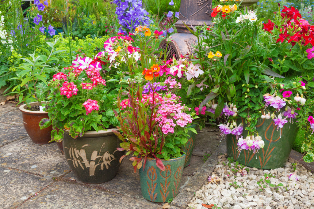
* Using every color
* Actually requires as much thought and experimentation as the other approaches
* Becomes a riot of color
* Neighboring plants need to be considered throughout the garden
SEEING MORE THAN THE BASICS
There may be only 12 colors on the color wheel, but blending and shading can create countless options in nature and in your garden design. Hue, intensity, and value are the keys to taking a garden from pleasing to artful. They guide the eye and tighten the focus.
Hue: Pure Color
* Very Rarely occurs in nature, but serves as a reference point
Intensity: The Potency or Saturation of Color
* Full Strength: undiluted hue
* Tint: hues lightened with the addition of white
* Shade: hues darkened with the addition of black
* Tone: a color dulled by gray
* Full strength hues pull the eye and work well at a distance or as an accent
* Tints can become washed out in full sun
* Tints and tones recede at a distance
Value: The Lightness or Darkness of a Color
* Yellow has the lowest value (Except for white, which is without color)
* Violet has the highest value (Except for black, which is all colors)
* The eye is drawn to the lightest value first. Crucial to consider in monochromatic gardens.
* Guide the eye with light values and use darker values as contrast and focal points. (That’s why using a green hedge behind a flower border works to draw the eye toward the darker flowers.
* Also using evergreens and structure and bones in the garden.)
* To get a strong feel for the values of the colors in your garden, look at it in B&W.
Temperature: The Degree of Warmth of a Color
* You’ve probably heard colors referred to as either hot or cold. Temperature is less cut and dry than the above terms. It tends to be something you sense more than quantify. Red, Yellow &
Orange are considered warm colors. Green, Blue, and Violet are considered cool. However, the temperature can be altered by blending colors. Add some red to violet and you get a considerably warmer color.
CONDITIONS THAT CAN ALTER COLOR
Keep in mind that the perception of color varies from person to person and can greatly be affected by surroundings.
* Lighting: Light changes the saturation of color. Red turns dull at twilight while white begins to glow.
* Surface Texture: The texture of a leaf or flower will affect how the light hits it and therefore how the color is perceived. The smoother the surface, the more light is reflected and the more saturated the color appears.
* Proximity: Colors lose their definition at a distance. A monochromatic garden can turn into a blur. Conversely, too much contrast close up confuses the eye and makes for an unsettling garden.
* Color Interactions: Just putting a contrasting color next to a flower will change the way we see its color. Gray can muddy true reds. Violet can become hotter next to a vivid orange.
* Age: Colors change as plants mature. Sometimes the color will change entirely. This is not so much a matter of perception, but it does need to be kept in mind when planning a design.
* Season: Nature changes her palette as the year progresses: spring pastels, summer vibrants, fall jewel tones. It’s only fair that the gardener should have the same prerogative. This is where choosing plants for a succession of blooms are paramount.
Combining color well is a matter of trial and error. If you’d like to experiment on a small scale, you can start as simply as putting together a bouquet. Containers are a colorist's best friend. You can test combinations in a pot and even move the pot around your garden to further explore.
Want to learn more about landscape design & installation faq?
Let our experienced team assist you with your holiday decorating and create a custom look for your home and landscape.
Call Breezy Hill Nursery at 262-537-2111.
NOTE: Any of our sales associates here at Breezy Hill Nursery would be happy to answer your questions about planting and caring for your tree. Call us at (262) 537-2111.
Do you have Gardening questions? Please call or stop by our garden center.
You might also enjoy this post about common landscaping questions.

Comments are closed.